Hand-writing music has been a tradition in jazz for many, many years. Nowadays, most people use software like Finale to emulate a handwritten look using special fonts. To really capture some of the magic of a great handwritten chart, however, takes more than simply selecting the right font. In this article, I’d like to share a few tips that can help take your handwritten charts to the next level in Finale.
There’s a lot of great material written on the subject, from the wonderful tomes of masters like Clinton Roemer or Sammy Nestico to the work from great modern copyists like Tim Davies or Lee Monroe. Ultimately, a great handwritten chart is simple, clean and easy to read on the fly.
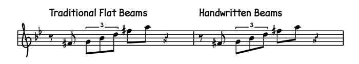
Beaming
If there’s one defining tool to handwriting music – other than a pen – it’s the straightedge. Traditional copyists spend hours slaving over a hot straightedge getting beams perfect, and their angular appearance is often a quick giveaway. Unlike some engraved music, beams follow the direction of the notes within the beaming group when there is an obvious direction, and when there isn’t, the beaming must still allow every stem its minimum length of one octave. With notes that use ledger lines, stems must be long enough to keep all beams within the staff.
To accomplish this in Finale, you’ll need to change a few parameters in your Document Options. Click Document > Document Options > Beams. Under Beaming Style, choose Base Slope on End Notes Only, and make sure to select Allow primary beams within a space. While this tells Finale to draw beams larger than a space, you also must designate exactly how steep the beams can get. This is often a matter of preference, but you can experiment using the Maximum Slope field. It’s set to a very small value by default, and I often try to start with a large amount and pare down the slope to taste. Try entering a value of 1/4″ (72 EVPUs) to see how it looks. You can always click Apply for a quick preview, then enter a smaller number if you wish.
You may also occasionally see special ledger lines like the following when large leaps occur in a handwritten score: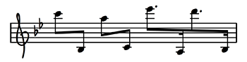
You can achieve this kind of effect by experimenting with the Reverse Stem and Beam Angle Tools.
Slurs
Slur contour, thickness, and location are what separate each copyist’s personal style. As such, for the meticulous, fine-tuning these specifics can become a rabbit hole. Fortunately, there are two simple rules you can follow to quickly improve the handwritten aesthetic of your piece:
- If the stems are up, put the slur under the noteheads.
- If the stems are down, put the slur above the noteheads.
- If you’re writing a long phrase where there are stems up and down, put the slur above the noteheads.
As I mentioned, you can spend a lot of time deciding how your slur should look. In Finale, click the SmartShape Tool, then click SmartShape > Smart Slur Options. Here you’ll find a lot of options, but for starters, try playing with the thickness of the slur. I often start pretty thick, using a vertical thickness of 6 EVPUs and a tip thickness of 2 EVPUs. This keeps the line thin yet easy to see, and helps prevent the slur from tapering too much at the tips, which often cause slurs to look like they were made with a pen instead of a computer.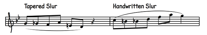
Phrasing
If someone were to ask me how to instantly improve their handwritten charts without having to change any of Finale’s more detailed settings, I’d suggest phrasing. So much of what makes an engraving look professional is the sheer amount of consideration put into how many measures fit in a system. I strongly recommend that you become well-versed in Finale’s Fit Measures dialog box, which you can reach by selecting an excerpt of music and clicking Utilities > Fit Measures. As a hard and fast rule, start with the number 4. Many copyists use four measures per system as a target, because so many musical phrases are done in multiples of four. There are a ton of really intricate rules to phrasing, but I always try to limit myself to either 4 or 3 measures per system. If I go any more or less than that, it has to be for a good reason, such as a technical passage that requires a lot of space.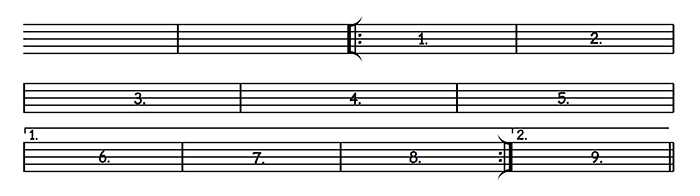
English
“English” is a hip way of talking about the text you see in your music, such as the title, composer, or copyright. It also refers to written directions you might see in the score. In my previous post about the Finale Copyist Text Font, I showed a few of the available possibilities using special characters. I wanted to give a little more specific instruction on some of the common conventions you’ll see when writing your parts.
Titles, for example, are often written with a huge underline, like this:
![]()
I achieved this by typing the following characters (without quotes): “° °TH°E °WR°IT°ER°’S° H°A°ND”
You can type the ° on Macs by pressing Shift+Command+8, or on Windows by holding the Alt key and typing the numbers 0176 on your keyboard.
Here’s another common one:
For this type of boxed text, you’ll need a left text character (“[“), a tall line (“Ù”), and a right enclosure (“]”). Put the line character in between each letter, like this (without quotes again): “[ ÙSÙWÙING ]” You’ll find that it takes a little trial and error to get positioning right, but it makes a world of difference in making your scores look authentic. There’s a lot more options like this in all of the handwritten text fonts, and I encourage you to try them out!
Font Choice
Speaking of fonts, another huge consideration to make is to actually choose which fonts you’d like to use! This includes both music and text fonts, as both can greatly affect how your final product will look. Finale offers two handwritten music fonts – The traditional Jazz Font, frequently seen in school jazz bands across the country, and the ubiquitous Broadway Copyist font included in Finale’s default Handwritten Document Style. Both have their own unique character and are based on the work of famous copyists in history.
There are also a number of fonts out made by third parties – Ash and Golden Age are two that come to mind – but many of these fonts haven’t kept up with modern computer conventions such as Unicode, so make sure you know that a font will work in your version of Finale before purchasing anything. Changing this font is as simple as clicking Document > Set Default Music Font, then choosing the font you’d like to use. I also highly recommend mixing and matching, as this is what gives your scores their own unique touch. I personally like to use Broadway Copyist for most notation, while using Finale Copyist for all text and numbers in my scores.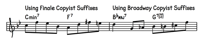
When you put all of these tips together, you’ll find that Finale can create charts rivaling the work of a master copyist. To give you some inspiration, I’m including a lead sheet I wrote recently that uses many of the elements discussed in this article. I encourage you to download and open it in Finale, and you can even use the Finale file as a template for your own lead sheets!
Which tips were most helpful for you? Are there any ‘special touches’ you add to your handwritten scores to make them look authentic? Share your favorite handwritten details with us on Facebook or Twitter.
 Peter Flom is a music production engineer and quality assurance technician at MakeMusic. A graduate of the Berklee College of Music, Peter has previously worked at KMA Studios in New York City, and in MakeMusic’s Customer Support department. He now spends most of his days developing new content for Finale and SmartMusic.
Peter is also a freelance arranger and engraver, and plays a mean guitar when nobody’s watching.