 Photo by Alejandro Guerrero
Parisian Robert Piéchaud really is a Renaissance man. Among his many and varied interests he’s a composer, a performer, and a veteran Finale software engineer, having created Human Playback, FinaleScript, Score Merger, the Medieval plug-in, and more. Clearly a proper interview on the Finale Blog is long overdue.
Recently Robert has returned his attention to music font design and today has released a greatly improved and expanded version of his beautiful font, November 2.0. So for today, we’ll limit our conversation to font matters.
Scott Yoho: Can you give us some background on the origin of the November music font?
Robert Piéchaud: November goes back to November 1998. I had decided to go to London for a couple of months to work with an engraver named Paul Ewers. In addition to engraving, I discovered something that piqued my interest even more: music font design. So I switched from engraving to font work – Paul was fine with that – and began reading scores and scanning them so that I could magnify the glyphs and examine them, enlarge them and print them out at as many as fifty times their size. I played with glyphs all day long!
At first I would scan existing characters and transform them into vectors – mathematical curves – which all digital fonts are. Fonts used to be made of pixels, or bitmaps, but then when the computers got more powerful you were able to define a glyph from points and the perfect curves that pass through them. And those curves are what make up a font. Once you free yourselves from the pixels you can go quite far with the curves. You can get really deep into the glyph; it’s fascinating. Then, little by little, manipulating curves on my own, I started designing a font: November!
SY: Did you perceive a need for new music fonts at the time?
RP: I guess you could say I just wasn’t satisfied with the other fonts I was seeing. There was little else on the market besides the standard default fonts. I felt the looks of these fonts weren’t enough alive. They were colder than what I personally wanted as a musician. I imagined a font you could say was human. Something that had really been engraved, etched with a stylus, like engravers used to do before we had computer notation. I wanted to be able to “feel” the ink.
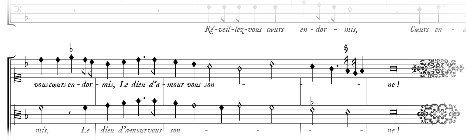
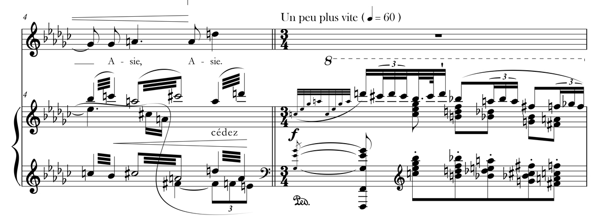
And so I tried to reproduce the microscopic irregularities that scores had back then. My great source of inspiration was Universal Edition Wien around the turn of the 20th century, when they started to publish the Vienna School composers. The style is also present in Boosey & Hawkes scores from that time, maybe a little later. I find a great elegance in those scores; they make you want to play the music. And that’s what a font is about – giving the musician the desire to make music. It works much in same way as books: a book that is beautifully made, well-bound, printed on good paper – that’s a book you want to pick up and read!
SY: It’s certainly a beautiful font. What inspired the new version you’re releasing today?
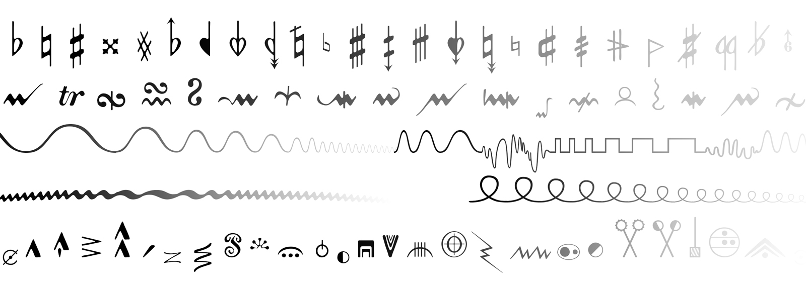
RP: There were so many new characters to be added! November 2.0 has over 1000 symbols compared to the initial 330. And the thing is, font standards have changed since 1998; we used to need to have different versions for Mac and Windows, and there were different formats. Also, music fonts were limited to just a bit more than 200 characters… and it was all kind of messy. Now all fonts can be distributed via OpenType Format (OTF) and Unicode. And the other thing is that I’m now in touch with the SMuFL group.
SY: We should probably provide some background on SMuFL.
RP: Yes indeed! SMuFL stands for Standard Music Font Layout. It’s the future of music font design! It’s basically a subset of Unicode for music characters, a new attempt to define what the ideal music character set ought to be.
SY: And SMuFL greatly expands the number of characters previously available in a music font?
RP: Yes. SMuFL has the potential to offer access to thousands and thousands of different characters. The project started in 2013 and has reached its maturity now, thanks to the work of Daniel Spreadbury and many others, world-wide, who have been working hard on it. The goal is to cover the widest variety of music possible, assigning individual spaces in Unicode to each character. All of the characters you might need for music from medieval times to the avant-garde, and everything in between: it’s all there, or just about.
SY: How many spaces might this represent when it’s all finished?
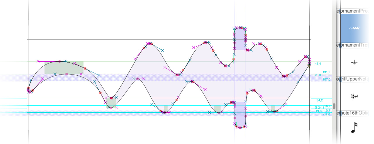
RP: The core of SMuFL is 2,400 or so. And then there’s space for alternates, different styles and shapes, and even new characters. For a font to be SMuFL compliant, though, you don’t need to include all 2,400, although the more the better. It just depends on the kind of music your font represents. For today’s music font designers, SMuFL is a great source of inspiration, but it’s also very challenging to reach the optimal compliancy. November, for example, has a wide range from the early Renaissance to today’s music with over 1000 characters, which is really a lot; some are included in SMuFL, some are unique to November, and some like advanced chant notation are less present in the font because they are covered specifically in another project of mine, Medieval 2.0. And beyond the character map, SMuFL also specifies some important “metadata”, such as the stem-notehead attachment point and so on. Overall November 2.0 fully complies with SMuFL, and is actually the first commercial font to do so!
SY: Can you describe how November can be used with Finale?
RP: November 2.0 is a package that includes the font files, component files (with libraries and templates), and documentation. It’s compatible with Finale, and now also with Sibelius and LilyPond. It is true that Finale is the easiest way to use the font because Finale has been very advanced in terms of Unicode since version 2012. With Finale 2014, compatibility is even better. Also the legacy set of characters (from spaces 32 to 255) is shared between the fonts – that’s the unique hybrid structure of November 2.0. And the package even supports legacy versions of Finale, as old as Finale 2001! In one word it’s really straighforward in Finale to switch from the standard Maestro or Petrucci font to November 2.0.
If you’re interested in learning more about November 2.0, you can download an extensive PDF presentation or purchase it here.
I’d like to thank Robert for sharing his perspective and images of November 2.0, and have invited him back for a proper interview about his music and his long relationship with Finale.