Petrucci, Engraver, and Maestro, three of the many music fonts included with Finale.
Most of us have changed the look of a word processing document by switching text fonts, say from Times to Arial. Have you similarly tried switching music fonts in Finale? While it can be dramatic to switch from a font with a handwritten appearance, like Broadway Copyist, to a font with an engraved look, like Maestro, there are many more subtle options available as well.
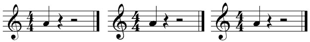
Take for instance the three examples above. In each the notehead, rests, clef, and time signature are slightly different. To some these small variations are very important.
Back in the 1990s, the Music Publishers Association (MPA) contacted MakeMusic (then Coda Music Technology) about Petrucci (show at left above), which was then the default music font in Finale. Because Finale had become, in their opinion, the standard in music notation software, they wanted to express their concern about Petrucci’s appearance, which they regarded as “anemic.”
Thus began a wonderful partnership in which none other than Arnold Broido helped us to develop “the ultimate music notation font.” Mr. Broido was the real deal. During his career he had served as the president of the MPA, ASCAP, and (music publishing company) Theodore Presser. Thanks to NAMM’s Oral History project, you can see and hear Arnold speak here.
I remember seeing drawings of the collaborative music font in progress (blueprints really) with degree angles indicating intricate specifications. Notehead sizes were also painstakingly specified. In fact everything, from eighth-note flags to bass clef thicknesses, was laid out in precise detail. I fondly remember many lunches with Bruce Nelson, the Los Angeles font developer we employed to actually make the MPA’s vision a reality within Finale.
The resulting font was named “Engraver,” which replaced Petrucci as Finale’s default music font. It appears as the middle font above, and you can see how its noteheads were much more robust than those in Petrucci. Alas, like many “ultimate” things, it too was eventually replaced in turn by Maestro, the third font above. Petrucci, Engraver, and a Maestro variation, “Maestro Wide” are all still available to Finale users, and Engraver remains popular with certain publishers.
Personally, my favorite music fonts are those with more oval noteheads, like Finale’s Maestro Wide font. You can see examples of Maestro Wide and the fonts included free with Finale here. While to some the differences between these fonts may seem very subtle, “subtle” is one of the many things Finale does exceedingly well!
Interested in purchasing additional fonts? You might check out Adobe’s Sonata, which is still in use despite preceding even Petrucci, and Robert Piéchaud’s elegant and warm “November” which is very popular with European publishers.
Not sure how to switch fonts in Finale? From Finale’s Document menu, simply choose “Set Default Music Font…”
We’d love to hear about your experiments in music fonts, or any questions you might have. Please share them by clicking on “Comments” below.