
Ketchup is a perfectly fine condiment. People only question your taste when you put it on everything.
The same goes for Times New Roman; few great music publishers use this text font prominently in their scores. It’s a great place to start, but no way to distinguish your artistry.
As I encouraged you to experiment with line widths in my previous post, this week I’d like to encourage you to venture beyond the ubiquitous Times New Roman, as well as boldly explore different music fonts.
Sans vs. Serif
To begin our discussion, I’d like to define sans-serif and serif fonts. While I’m certain that “sans” is a French word that means “without,” I’m just guessing that “serif” comes from a Roman word for “fancy thingy.” In the example above the sans-serif font (Arial) has no fancy lines on the end of the s, r, i and f, while the serif font (Times New Roman) does.
Much has been written about which font type is more legible; generally book-length text is thought to be more readable in serif fonts, while in shorter doses (and at smaller sizes) some will tell you that sans-serif fonts are more legible. I encourage you to do a web search on the topic if you’d like to learn more. In music, I think a sans serif font, in headers and footers, lends itself to a more modern look. On the other hand, I generally avoid them in the actual music, but your tastes may differ.
Text Fonts
Today everyone with a computer has a wide variety of fonts at their disposal. Part of creating a style guide for my clients involves the selection of both text and music fonts. I might present a new client with three or four font options, including serif or san serif headers and footers (titles, composer, lyrics, etc. – everything above and below the music, including copyrights). Personally, I like to see header and footer text to be all in the same font, and I don’t personally like mixing sans and serif fonts, but feel free to try them as an option.
Want some best practices? Don’t pick a font you’ll be embarrassed by in ten years. I’d suggest avoiding overly ornate or goofy fonts for titles, and I’d always advocate for readability: If others have to struggle to read your title, your flowing script font may not be the best fit.
To my eye, Bodoni, Palatino, and New Century Schoolbook are all good-looking text fonts. The best publishers often end up selecting something along these lines.
Want to set yourself apart? For a modest fee, you can purchase some really spectacular text font alternatives from Adobe and Linotype. Since most people are unwilling to part with even $29, this is a relatively inexpensive way to distinguish your creations.
Keep in mind that like most things in life, there is a continuum. On one end is bland: everything in Times New Roman. Near the other end is goofy, and even further out is a different goofy font for every item in your score. This has all the aesthetic beauty of a poorly planned yard sale (or landfill) and should be avoided at all costs (unless that’s your desired effect).
Lyrics and Numbers
Times New Roman is so wide it makes spacing for lyrics difficult. This problem was my inspiration to create the Finale Lyrics font: it makes it possible to get more lyrics, legibly, on a line of music.
Here’s an example, using default spacing settings, in Times New Roman – look at how crowded the lyrics appear, especially in “spacious skies” and in each hyphenated word: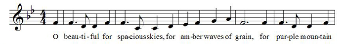
Here’s the same example in Finale Lyrics: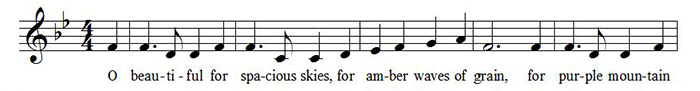
Think about the fonts you use for numbers, too. Measure numbers, tempo markings, fingerings, rehearsal marks, multi-measure rests, and repeats all contribute to your style and should all work together.
Portability
One of the reasons that Finale uses Times New Roman as a default is that it is one of the few fonts that is available on all devices. Buying a nice but somewhat obscure font is great if you plan to distribute your music via print or pdf files. It can prove problematic, however, if you plan to distribute Finale files, and you want everyone’s printout to look exactly the same. Please note that the fonts used in your Finale file do not travel with your file, and generally speaking the license you purchase fonts by probably doesn’t allow you to send these fonts along with your Finale files. And of course, this problem is not unique to Finale. For many, distributing PDF files is a good solution.
Music Fonts
Finale ships with three engraved-looking music fonts (Maestro, Engraver, and Petrucci) as well as two music fonts with a handwritten appearance (Jazz and Broadway Copyist). For this piece we’ll focus on the first three options:
Petrucci is Finale’s original font, somewhat similar to Adobe’s Sonta font, which is the grandfather of all digital music fonts. To me it is characterized by small noteheads.
Engraver is Petrucci’s immediate successor. Engraver features bigger noteheads, and remains a favorite of many publishers today.
Maestro, the current Finale default font, was modeled after Notaset transfers which were a preferred look of many publishers in the era immediately preceding music notation software. Maestro’s noteheads aren’t as wide as those in Engraver, and its articulations are quite a bit different.
I would encourage you to try out all three fonts. In Finale it’s very easy to make this change – simply go to Document > Set Default Music Font. Want even more options? Go to Document >Document Options > Fonts. If you’re not using Finale, it’s no secret you can install these fonts for use in your software by downloading the Finale free trial.
Of course, using the various music fonts included with Finale represents only a starting point.
Other third-party font options include November (a beautiful font that emulates plate engraving), Musegraph, and others. Again, this is your chance to distinguish yourself – stop being so dang cheap. The folks at Musegraph will even digitize your signature and their fonts are reasonably priced.
I also suggest mixing and matching your music fonts, using some characters from this font and other characters from that. Many publishers do. For example they’ll use Maestro noteheads and Engraver articulations. Some people feel the Maestro accent is too wide and prefer the narrower Engraver accent. Finale users can find links to font character sets, like this one for Maestro (for both Mac and Windows) in Finale’s Help menu, and everyone can find them online.
Similarly, some people will substitute Engraver tremolos for the default Maestro tremolos which I might describe as very sturdy. Open up a character map and see if there’s something that either grabs your eye – or doesn’t.
One of the easiest ways to distinguish your music is by trying out different clefs – it’s one of the first and most noticed aspects of any page of music.
Font Customization
In my music, I use my own clefs, created in a font editor. I personally use Fontlab, but there are several really good open source free font editors on both platforms.
As I mentioned above, there are issues surrounding portability when using proprietary fonts. In addition, creating fonts that work on both Mac and Windows can also produce additional hurdles. (If you choose to create your own music font, you can eliminate these issues by adopting the SMuFL standard).
With those caveats having been said, if your goal is to simply create your own clefs and noteheads, it’s reasonably simple and can be very rewarding.
I have even heard of copyists who have created minimally original fonts simply because they are less portable – working sort of as a poor mans’ copy protection – however, be prepared that this may upset some customers.
I hope this brief overview of font choices inspires you to be more adventuresome in your font usage and more discriminating when reviewing your own engraving work as well as the work of others. For my next post I plan to share a free font with you. If you’d like to be notified when new Finale blog posts are published, click on the SUBSCRIBE button in the upper right corner of the blog.

Mark Adler is MakeMusic’s notation product manager/senior editor, a professional trumpet player, and a freelance music editor and engraver.
When he’s not making music, or working on his wife’s “honey do” list of home improvements, he might be found teaching the neighbor kids the finer aspects of pumpkin carving.